

Gary M. Klass is associate professor in the Department of Politics and Government at Illinois State University.
Papers:
2004: Statistics for Political Science Majors presented at the Joint Statistical Meeting of the American Statistical Association (ASA)
2008: Just Plain Data Analysis presented at the Joint Statistical Meeting of the American Statistical Association (ASA) 6up slides
Just Plain Data Analysis
2nd ed. (2012)
Paperback 202 pages. Rowman & Littlefield Publishers (April 13, 2012)
Hardback
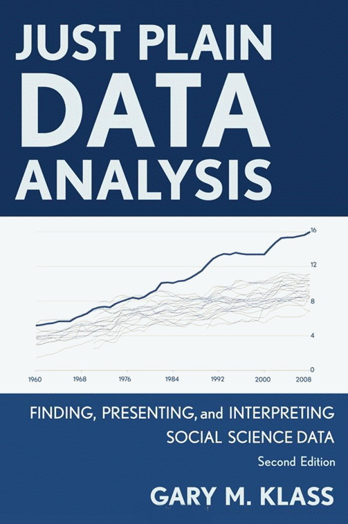
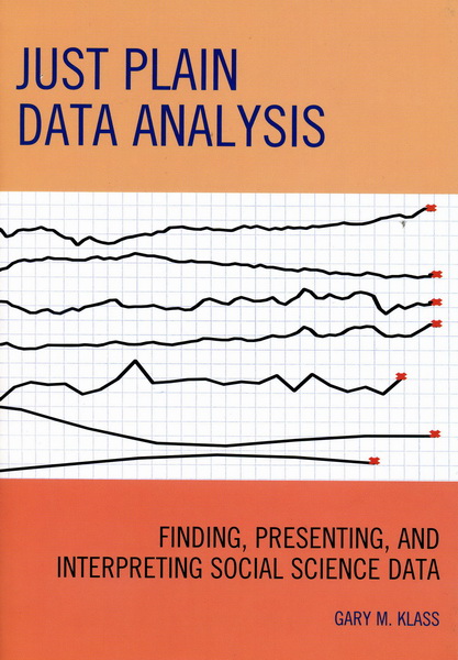
Table of Contents 2nd edition (Four new chapters):
- Measuring Political, Social, and Economic Conditions
- Measuring Racial and Ethnic Inequality
- Statistical Fallacies, Paradoxes and Threats to Validity
- Examining a Relationship: New York City Crime Rates
- Tabulating the Data and Writing About Numbers
- The Graphical Display of Data
- Voting and Elections
- Measuring Educational Achievement
- Measuring Poverty and Inequality
Index
Just Plain Data Analysis
1st ed. (2008)
Paperback 186 pages. Rowman & Littlefield Publishers (May 21, 2008)
Hardback
Description:
Just Plain Data Analysis is designed to teach students statistical literacy skills that they can use to evaluate and construct arguments about public affairs issues grounded in numerical evidence. Students will learn to find, interpret, and present commonly used social indicators, the quantitative measures of the performance of societies' institutions. Although critical for careful social science research, these skills are not often covered in qualitative or quantitative research methods and statistics texts. Clear, concise, and readable, Just Plain Data Analysis will support students' work in a variety of courses, stimulate critical thinking, and be a helpful reference in future careers.
Table of Contents 1st edition:
- Analyzing Political, Social, and Economic Indicators
- Constructing Good Tables
- Creating Good Charts
- Voting and Elections
- Measuring Educational Achievement
- Measuring Poverty and Inequality
- Finding the Data
Index
Preface: What is Just Plain Data Analysis? (1st edition)
“JUST PLAIN DATA ANALYSIS” is, simply, compiling, evaluating, and presenting numerical evidence to support and illustrate arguments about politics and public affairs.
There is a realm of public debate about society's most contentious issues where arguments are grounded in hard evidence and sound reasoning. Often this evidence comes in the form of numerical measures of social conditions and of the effectiveness of public policies and governing institutions. When contending sides advance their causes by finding, presenting, and interpreting such evidence with clear thinking, the quality of public debate and the chances of devising effective solutions to society's problems are greatly increased.
The contending sides in such debate are rarely dispassionate and often present misleading evidence and deceptive reasoning, but the shortcomings of such arguments are transparent to those who can apply critical thinking skills to the evidence. This is often not the case in other realms of public debate, prevalent in today's broadcast media and, increasingly, in academic discourse, where competing anecdotes and malign characterizations of the other sides' motives are all too common.
Just plain data analysis is the most common form of quantitative social science methodology, although the statistical literacy skills and knowledge it entails are often not presented, or presented well, in social science research methods and statistics textbooks. These skills involve finding, presenting, and interpreting numerical information in the form of commonly used social, political, and economic indicators. They are practical skills that students will find they can readily apply in both in their subsequent coursework and in their future careers.
Just plain data analysis differs from what is commonly regarded as quantitative social science methodology in that it usually does not involve formal tests of theories, hypotheses, or null hypotheses. Rather than relying on statistical analysis of a single dataset, just plain data analysis, at its best, involves compiling and evaluating all the relevant evidence from multiple data sources. Where conventional approaches to quantitative social science analysis stress the statistical analysis of data to model and test narrowly defined theories, just plain data analysis stresses presenting and critically evaluating statistical data to support arguments about social and political phenomenon.
Good examples of just plain data analysis are found in many books that advance comprehensive and data-based arguments about social issues written by public intellectuals for a broad public audience. Often these works shape public debate about critical public policy issues. Charles Murray's 1984 book, Losing Ground, for example, presented evidence of rising welfare caseloads and spending, undiminished poverty, and the breakdown of the two-parent family, which shaped conservative attacks on American welfare programs and eventually led to the dramatic welfare reform policies during the Clinton administration. Employing much of the same method of analysis, Jeffrey Sachs's The End of Poverty, coming from a decidedly different ideological perspective, addresses issues of global poverty and may serve much the same role in spurring progressive solutions to the intractable poverty of developing nations.
At times both sides of a public debate use the same evidence to draw different conclusions. Thus, the annual State of the World report, published by the environmentalist organization of the Worldwatch Institute, regularly describes the deterioration of the world's environment on a wide range of ecological indicators. Bjorn Lomborg's critique of that report in The Skeptical Environmentalist counters with evidence that long-term trends in deforestation and in food, energy, and raw material production generally do not support the environmentalists' dire predictions.
In The Politics of Rich and Poor, historian Kevin Phillips argued that the Reagan administration policies were producing a new era of accelerating concentration of wealth, paralleling that of the Gilded Age and the Roaring Twenties. In tables and charts, Phillips presents statistic after statistic demonstrating that the United States has the highest inequalities of wealth and income in the developed world, the inequalities of wealth and income are steadily increasing, the divergence in pay for corporation executives and their employees is widening, and the rich are much richer and the poor and middle class poorer. The theme, using the same Gilded Age metaphor and fifteen more sears of evidence, is repeated with fewer tables and no charts, but often with a much more careful analysis of the statistical evidence, in Paul Krugman's recent book, The Conscience of a Liberal.
Robert Putnam's Bowling Alone, arguing that America faces a critical decline in social capital, is a classic example of just plain data analysis. Almost all of Putnam's analysis is grounded in quantitative data, from a wide variety of sources, presented in charts and graphs. Putnam describes his strategy as attempting to “triangulate among as many independent sources of information as possible” based on the “core principle” that “no single source of data is flawless, but the more numerous and diverse the sources, the less likely that they could all be influenced by the same flaw.” Legions of social scientists have applied Putnam's core ideas to many fields of scholarly research and public officials regularly cite his work in advancing new approaches to public issues.
Works such as these, and others addressing policy issues as diverse as gun control, the death penalty, racial and gender discrimination, national health care, school vouchers, and immigration, advance the argument on one side of the public debate and often set the research agenda for additional social science research.
Finding, Presenting, and Interpreting the Data
There are three tasks and skills involved in doing just plain data analysis that traditional research methods courses and textbooks often neglect: finding, presenting, and interpreting numerical evidence.
Finding the Data
With the advances in information technology over the past decade, there has been a revolution in the amount and availability of statistical indicators provided by governments and nongovernmental public and private organizations. In addition to the volumes of data provided by the U.S. Census Bureau, many federal departments now have their own statistics agency, such as the National Center for Education Statistics, the Bureau of Justice Statistics, the National Center for Health Statistics, the Bureau of Labor Statistics, and the Bureau of Transportation Statistics, providing convenient online access to comprehensive data collections and statistical reports. In recent years, the greatest growth in the shear quantity of statistical indicators has been in the field of education. The mandated testing under the No Child Left Behind law and the expansion of the Department of Education's National Assessment of Educational Progress have produced massive databases of measures of the performance of the nation's schools that, for better or worse, fundamentally transformed the administration of educational institutions.
There has also been significant growth in the quantity and quality of comparative international data. The Organisation for Economic Co-operation and Development (OECD) now provides a comprehensive range of governmental, social, and economic data for developed nations. For developing nations, the World Bank's development of poverty indicators and measures of business and economic conditions and the United Nations' Millennium Development Goals database have contributed greatly to public debate and analysis of national and international policies affecting impoverished people across the world. With the Trends in International Math and Science Study (TIMSS) and the Programme in International Student Assessment (PISA) both having completed multiyear international educational achievement testing, rich databases of educational system conditions and student performance are now easily accessible.
Similar growth has taken place in the availability of social indicator data derived from nongovernmental public opinion surveys that offer consistent times series and cross-national measures of public attitudes and social behaviors. Time series indicators can be readily obtained online from the U.S. National Elections Study and the National Opinion Research Center's annual General Social Survey and comparative cross-national data indicators can be accessed from Comparative Study of Electoral Systems, the International Social Survey Programme, and World Values Survey.
Finding the best data relevant to the analysis of contemporary social and political issues requires a basic familiarity with the kinds of data likely to be available from these sources. Social science research methods courses often give short shrift to this crucial stage of the research process that involves skills and expertise usually acquired by years of experience in specific fields of study. Too often, the data are a “given”: the instructor gives a dataset to the students and asks them to analyze it. The concluding chapter of this book addresses the topic in some detail, but finding the best data is the subtext for all of the chapters and the examples and illustrations that follow.
Presenting the Data
Good data presentation skills are to data-based analysis what good writing is to literature, and some of the same basic principles apply to both. More important, poor graphical and tabular presentations often lead both readers and writers to draw erroneous conclusions from their data and obscure facts that presentations would reveal. Some of these practices involve deliberate distortions of data, but more commonly they involve either unintentional distortions or simply ineffective approaches to presenting numerical evidence.
The past two decades have seen the development of a substantial literature the art and science of data presentation, much of it following Edward R. Tufte's pathbreaking work, The Visual Display of Quantitative Information. With his admonitions to “show the data,” “minimize the ink-to-data ratio,” and avoid “ChartJunk,” Tufte established many of the basic rules and principles of data presentation and demonstrates over and over again how effective a presentations combined with clear thinking can reveal truths hidden in the data. Howard Wainer's work extends Tufte's standards and demonstrates many errors that have ensued from statistical fallacies and faulty tabular and graphic design. Few research methods and statistics texts address these standards of data presentation in more than a cursory manner and many demonstrate some of the worst data presentation practices.
Although the development of spreadsheet and other software has greatly simplified the tasks of tabular and graphical data presentation, it has also greatly facilitated some very bad data presentation practices.
Interpreting the Data
Good data analysis entails little more than finding the best data relevant to a given research questions, making meaningful comparisons among the data, and drawing sound conclusions from the comparisons. To evaluate arguments based on numerical evidence, one must assess the reliability and validity of the individual measures used and validity of conclusions drawn from comparisons of the data. Assessing the reliability and validity of social indicator measurements requires that one understand how the data are collected and how the indicators are constructed. Many research methods and statistics texts address issues of measurement merely as matters of choosing the appropriate level of measurement for variables (nominal, ordinal, or interval) and of calculating sampling error. As a practical matter, such issues are usually irrelevant or trivial when one undertakes just plain data analysis. With just plain data analysis, almost all of the data are interval measures, in the form of ratios, percentages, and means, even if the base question for the indicator is nominal or ordinal. Measures of sampling error usually constitute the least important aspect of measurement reliability. In chapter 1 we will see that the least reliable measures of crime rates, based on the FBI Uniform Crime reports, have far less sampling error (actually no sampling error) than the more reliable measures based on the National Crime Victimization Surveys. The same thing occurs with the measurement of educational achievement discussed in chapter 5: the No Child Left Behind tests of all students are shown to be less reliable than the National Assessment of Education Progress tests based on national samples of students. Although assessing sampling error sometimes has a crucial role in some data analysis, in both academic research and news reporting the emphasis on sampling error often conveys a false sense of the reliability of data and distracts attention from more serious measurement problems.
Although some social scientists refrain from using the word “causation,” the substantive import of most data analysis of any kind is that it provides evidence from which we can conclude that something causes something else. Chapter 1 presents the basic framework for drawing causal conclusions of numerical comparisons: one can be confident that an observed relationship is a causal relationship if one can reasonably conclude that alternative explanations for the relationship do not withstand scrutiny. It stresses that avoiding logical fallacies, rather than avoiding violations of statistical assumptions, is the key to not drawing false causal conclusions from the analysis of one's data. Just plain data analysis will never offer a definitive proof of casual claims, but nor will it pretend to.
Why We Should Teach Just Plain Data Analysis
Often a fear of mathematics, combined with nonsequential curricular requirements, leads students to take a research methods and statistics course only in their last semester of study. In departments that require freshmen to take introductory methods courses, the required course is often the last time in students' academic careers that they will actually do the quantitative analysis that is taught. It may even be the last time they will have to read research employing the methods that are taught. Just plain data analysis involves skills and expertise that students can readily apply to the analysis of evidence presented in their course literature and in conducting their own research for term papers and independent study projects. Moreover, the data analysis and data presentation skills described here have widespread application in a wide range of future careers in both government and the private sector. It is a primary mode of communication in government and is found in the studies, annual reports, and PowerPoint presentations of almost every governmental agency and advocacy group or in any career that requires writing clearly and succinctly with numbers. It is not too late to read this text in the last semester of your senior year of college, but it is later than it should have been.
For departments that offer courses in both quantitative and qualitative methodology, just plain data analysis fills the methodological chasm that divides the social sciences. Those students who will go on to learn and apply the knowledge of the central limit theorem, multiple regression, factor analysis, and other less-plain statistical applications will discover that many of the principles of just plain data analysis will greatly improve the quality of the work. Those who embrace qualitative analysis out of bewilderment at the often tortuous mathematical complexities of contemporary quantitative social science may find less madness in the methods presented here. Students in almost every field of study encounter just plain data analysis all the time in the charts and tables presented in their textbooks.
In today's world the exercise of effective citizenship increasingly requires a public competent to evaluate arguments grounded in numerical evidence. As the role of government has expanded to affect almost every aspect of people's daily lives, the role of statistics in shaping governmental policies has expanded as well. To the extent the public lacks the skills to critically evaluate the statistical analyses that shape public policy, more crucial decisions that affect our daily lives will be made by technocrats who have these statistical skills or by those who would use their mastery of these skills to serve their own partisan or special interest ends.
Organization of This Book
Although the logic ordering of doing just plain data analysis is to find, present, and then interpret the data, it makes sense to cover these topics in reverse order. Finding the data and constructing a data presentation presupposes an understanding of how the data are going to be interpreted. Chapter 1 begins by stressing that an understanding of how social indicators are produced and constructed is fundamental to every other aspect of the data analysis. It then addresses data interpretation: how to assess the reliability and validity of the indicators and how to draw sound causal conclusions from data comparisons.
Chapters 2 and 3 illustrate the basic principles of the art and science of presenting numerical information in tables and charts and contain several examples of bad tabular and graphic design. What follow are three chapters applying and illustrating the principles of the first three chapters in more detail, focusing on the topics of voting, education, and poverty. Each of these chapters begins with a discussion of comparative international statistical measures, followed by U.S. data, and ends with an evaluation of specific examples of data-based arguments.
The last chapter serves as a general guide to finding international and U.S. national social indicator data and contains a discussion of the data sources used throughout the book. A companion website (lilt.ilstu.edu/JPDA) for this text contains hyperlinks to all the spreadsheet files used to construct the tables and charts, the original data sources, and the other data sources listed in chapter 7. All of the charts prepared for this book were constructed with the 2007 version of Microsoft Excel® charting software, although some of the charts, particularly the box-plots and the data labels shown on the scatterplots, required the use of free, downloadable add-ins. The companion website contains links to those add-ins and instructions, tips, and tricks for using Excel to do the things demonstrated in the book.
Acknowledgments
The starting point for this book was a research methods course I taught to political science students at Binghamton University at a time when analyzing data required the use of keypunch and punch-card counter sorter machines. I have taught the methods course many times since, each time adding more of the practical data analysis material presented in this book. From the students in these courses, I have learned what they find most perplexing and challenging about numbers, and they have challenged me to find better ways of presenting this material. Working on their “data profile” term papers, many students discovered datasets and data sources that I was not familiar with and that are cited throughout this book. Three students in my Quantitative Reasoning course contributed more directly: Molly Miles and Shannon Durocher found several errors in a late draft of the book, and Lesley Clements contributed the first draft of the chart shown in figure 3.12.
To prepare the tables and charts in this book, I acquired near mastery of the 2003 Microsoft Excel charting software and considerable experience with the 2007 version. Excel is much more powerful than a counter sorter, but the frustrations are the same. My masters in my quest to earn a black belt in Excel charting were the regular contributors to the microsoftpublic.excel.charting newsgroup: Rob Bovey, Debra Dalgleish, Shane Devonshire, Bernard Liengme, Tushar Mehta, Jon Peltier, Andy Pope, and John Walkenbach. Over and over again they found solutions to what, for me, were the most unsolvable charting problems. Their replies to my inquiries—and those of thousands of novice and experienced charters—were often simple, direct, and quick, and always courteous.
I am deeply indebted to my colleagues for their encouragement and comments on the convention papers that led to this book and on the initial drafts of the manuscript: Jack Chizmar, Gary King, Nancy Lind, Milo Shields, Howard Wainer, Bill Wilkerson and, much more than a colleague, Patricia Klass. For their proofreading and editing of the manuscript I am indebted for the excellent contributions of three Illinois State graduate students: Jennifer Swanson, Zach Wolfe, and Kara Bavery. And finally, for their professionalism, encouragement, and assistance, many thanks to Niels Aaboe, Catherine Forrest Getzie, and Asa Johnson at Rowman & Littlefield.
Notes 1. Charles Murray, Losing Ground: American Social Policy, 1950-1980 (New York: Basic Books, 1984). 2. Jeffrey Sachs, The End of Poverty: Economic Possibilities for Our Time (New York: Penguin Press, 2005). 3. The Worldwatch Institute, The State of the World, 2006 (New York: W. W. Norton, 2006). 4. Bjorn Lomborg, The Skeptical Environmentalist (Cambridge: Cambridge University Press, 2001). 5. Kevin Phillips, The Politics of Rich and Poor: Wealth and the American Electorate in the Reagan Aftermath (New York: HarperPerrenial, 1991). 6. Paul Krugman, The Conscience of a Liberal (New York: W. W. Norton, 2007). 7. Robert D. Putnam, Bowling Alone (New York: Simon and Schuster, 2000), 419. 8. Edward Tufte, The Visual Display of Quantitative Information (Cheshire, Conn.: Graphics Press, 1993). 9. Howard Wainer, Visual Revelations: Graphical Tales of Fate and Deception from Napoleon Bonaparte to Ross Perot (Mahwah, N.J.: Lawrence Erlbaum, 1997).
Reviews and Comments:
In Just Plain Data Analysis, Gary Klass analyzes simple statistics that involve sophisticated reasoning. This book cuts through paradoxes, fallacies and socially-constructed statistics to uncover the basic elements of data analysis. A must-read for anyone interested in statistical literacy. (Milo Schield)
As a teacher of research methods, I have been waiting for a book like Just Plain Data Analysis. By focusing on finding, presenting and interpreting data, Klass encourages students to develop the critical thinking skills that they will need once they leave the university. The writing is clear and the examples are excellent. The discussion of reliability, validity, and ecological fallacy is the best I have read in an undergraduate text. The many table and chart examples will help students improve their skills. (Bill Wilkerson)
This short book is a useful supplement to traditional statistics and research method texts....Recommended. (Choice)
With humor and political balance, Just Plain Data Analysis offers a pithy guide to finding, presenting and interpreting social science data ranging from crime to elections. Recommended for students, teachers and policymakers who want to understand where the data comes from and how to use it responsibly. (Mark Maier)